Overview
DataVisualizer is an easy to use program for turning your raw data into visual graphs for presenting and analysing. Under the hood, DataVisualizer utilizes Python libraries tkinter for a simple user interface and matplotlib for drawing graphs.
DataVisualizer is designed with not so tech-savvy users in mind, and guides the user through the whole process of turning data into beautiful readable graphs.
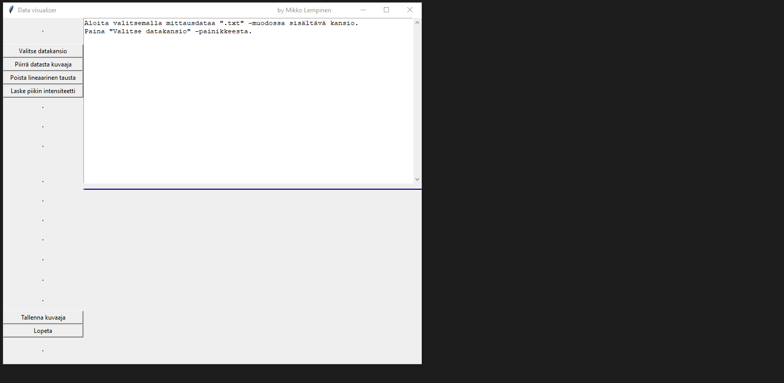
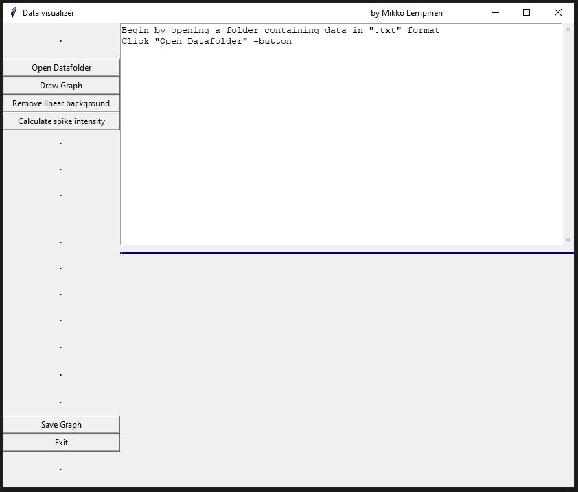
Below this text box you can see DataVisualizer in action. In the demo, the user turns their raw argon photoionization spectrum data into a readable graph and analyses the data with built-in tools (language in demo is Finnish). The user begins by selecting a folder containing the data they want to analyse. Once a folder has been selected, the program scans the folder for data files and informs the user how many files were read and if there were unreadable files. The user can then draw a graph from the data and begin utilizing the built-in tools ('Remove linear background' and 'Calculate spike intensity' implemented in the demo). And on every step of the way, the program helps the user by informing what are the possible next steps they may want to take.
At any time the user can save currently shown graph as an image to their device to be used in presentations etc.
- Built with Python